Transparent Knee App
A devices management app for health management for knee
Introduction
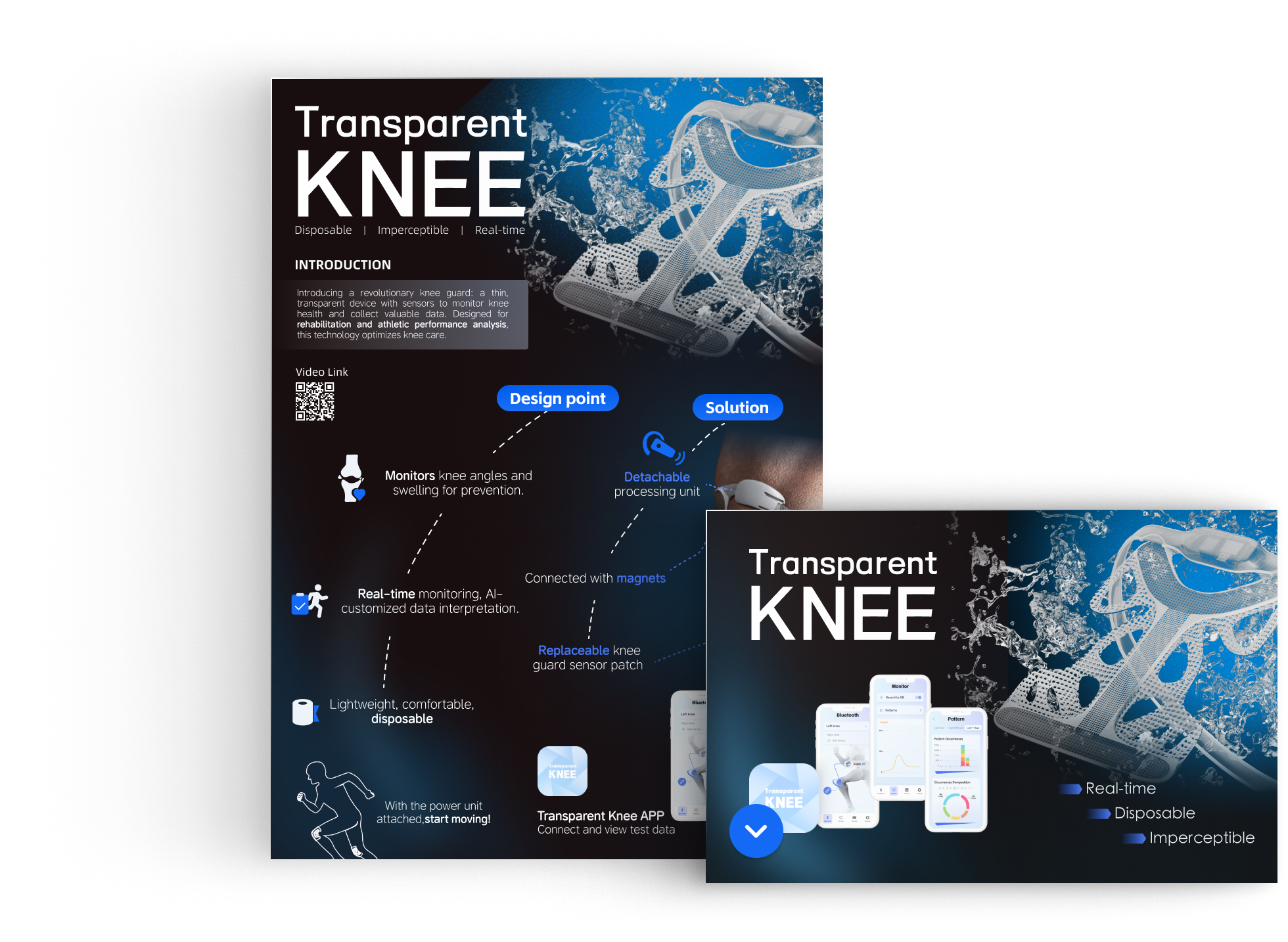
Introducing a revolutionary knee guard: a thin, transparent device with sensors to monitor knee health and collect valuable data. Designed for rehabilitation and athletic performance analysis, this technology optimizes knee care.
Overview
About
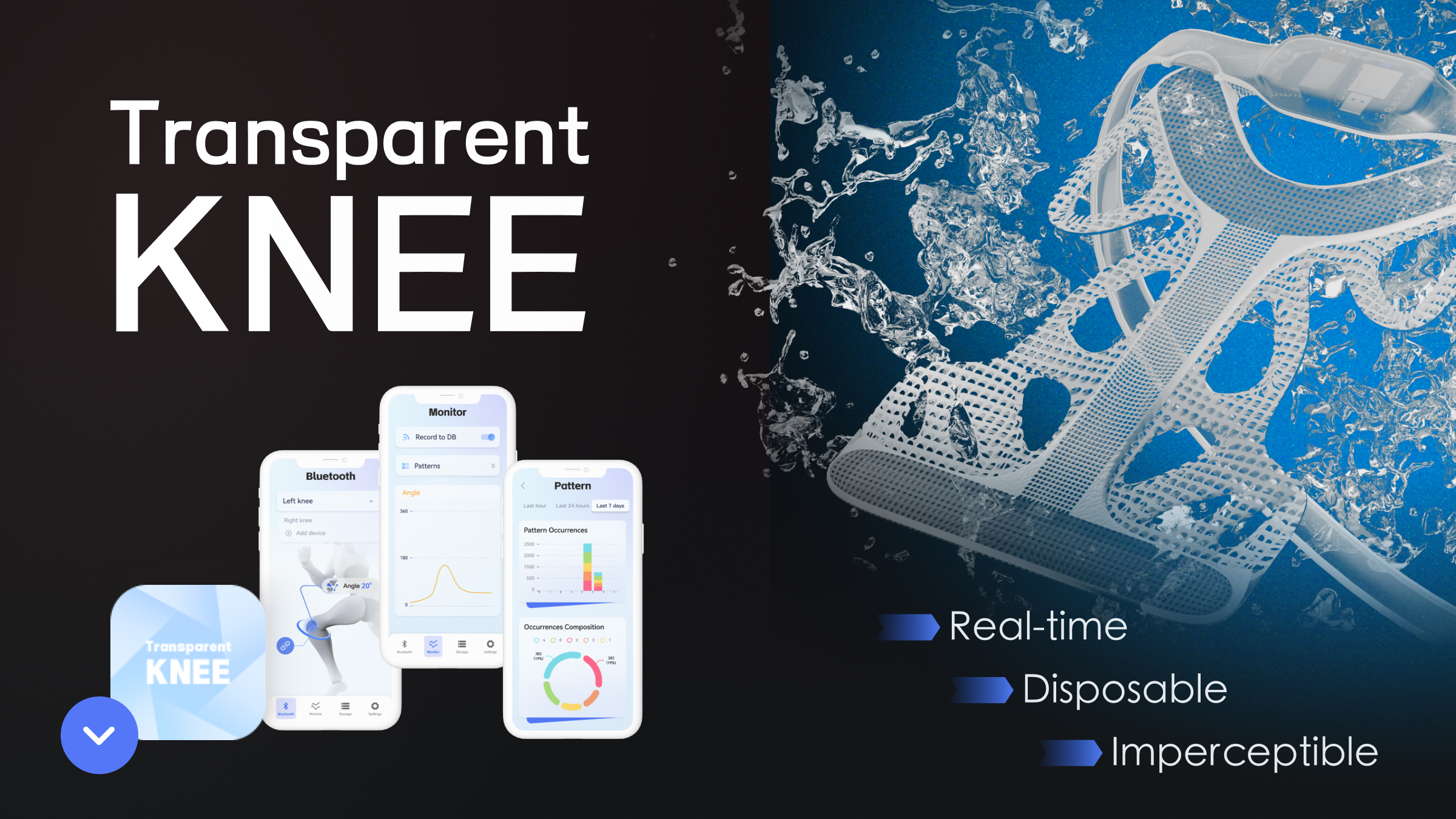
The Transparent Knee app gives users access to their health condition while using the wearable products.
Duration
- 4 Weeks
My Role
- UI/UX Designer
Tools
- Figma
- Rhino 7 & Keyshot
- Adobe After Effects
Platform
- iOS
- Andriod
The Journey
- Competitive analysis
- User interview
- Moodboard
- User flow
- Low-High fidelity wireframes
- Usability test
- Feedback & critique
- Iterate
- Prototype
Context
The Problem
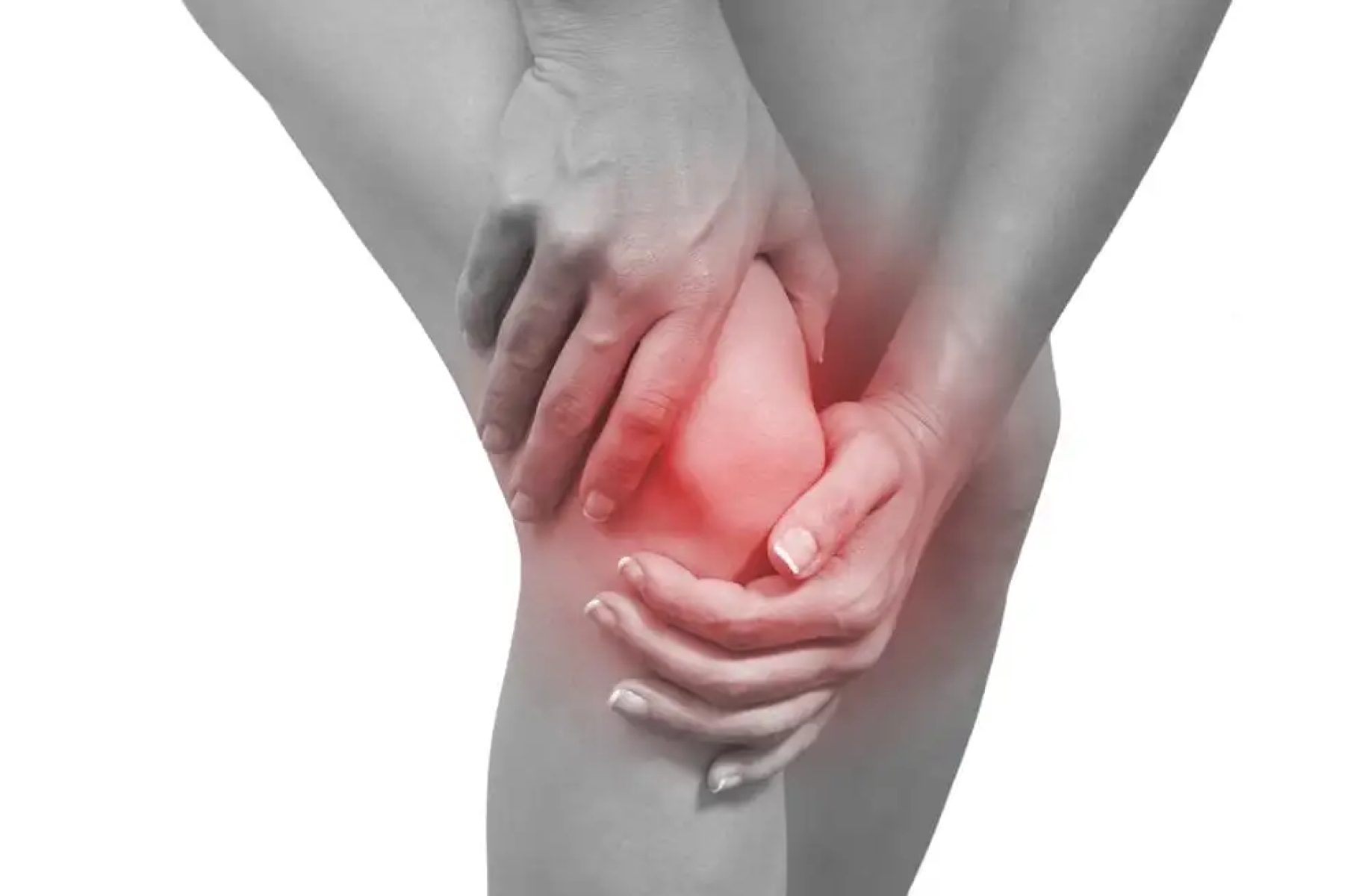
As for the conventional knee guards products, I find it challenging to wear comfortably for its bulkiness. And the data collected during medical check-ups might be too complex or technical for everyday users to understand.
The Goal
What information about knee health would users most want to see through the app? Why?
Learning From Others
First, I conducted a quick competitive analysis of a few companion apps and sports-related apps to better understand what functionalities they have, why they are helpful, and the design patterns they use.
- Target Demographic
- Individuals with knee osteoarthritis and athletes seeking performance analysis and injury prevention.
Gathering information
Since this is a health management app, what’s a better way than asking players about their needs and wants. I gathered insights from 7 users of Transparent Knee in PolyU and learned about their exercise habits and daily protection
Discovery
To define the MVP functionalities for the Transparent Knee app based on user needs, the following features would be essential:
- Health Monitoring
- Real-time tracking of knee health metrics (e.g., joint stress, movement patterns)
- Alerts and Recommendations
- Providing actionable alerts and personalized recommendations for knee care
- Data Management
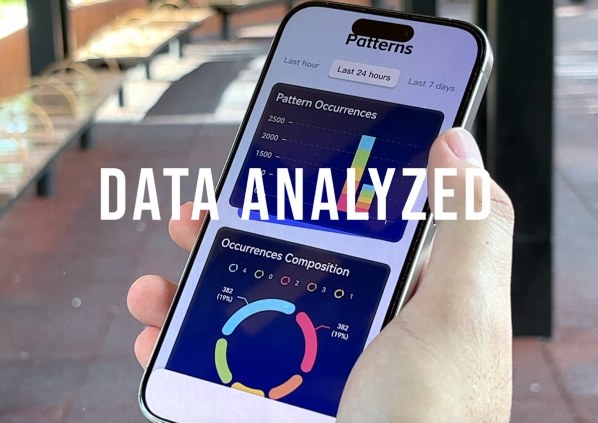
- Users should have access to detailed reports on their knee health, including fatigue analysis based on movement frequency and duration.
User Flow
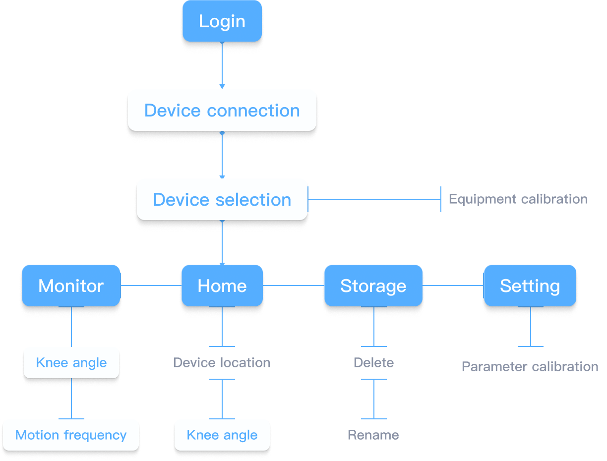
The user flow for the device management app is very simple. The intention is to give uers access to the health track of the knees that are the most important to them
Design Solutions
Using the user flow above as guidance, I sketched out possible solutions for iOS and Android platforms. I made some changes along the way while referencing the results from my competitive analysis.
Understanding The Human Interface Guidelines & Material Design
I spent some time studying both design guidelines and downloaded BlueStacks to experience and become more familiar with the Android platform, and then I made sure the grid and elements aligned with both design guidelines.

The Theme
Design Strategy
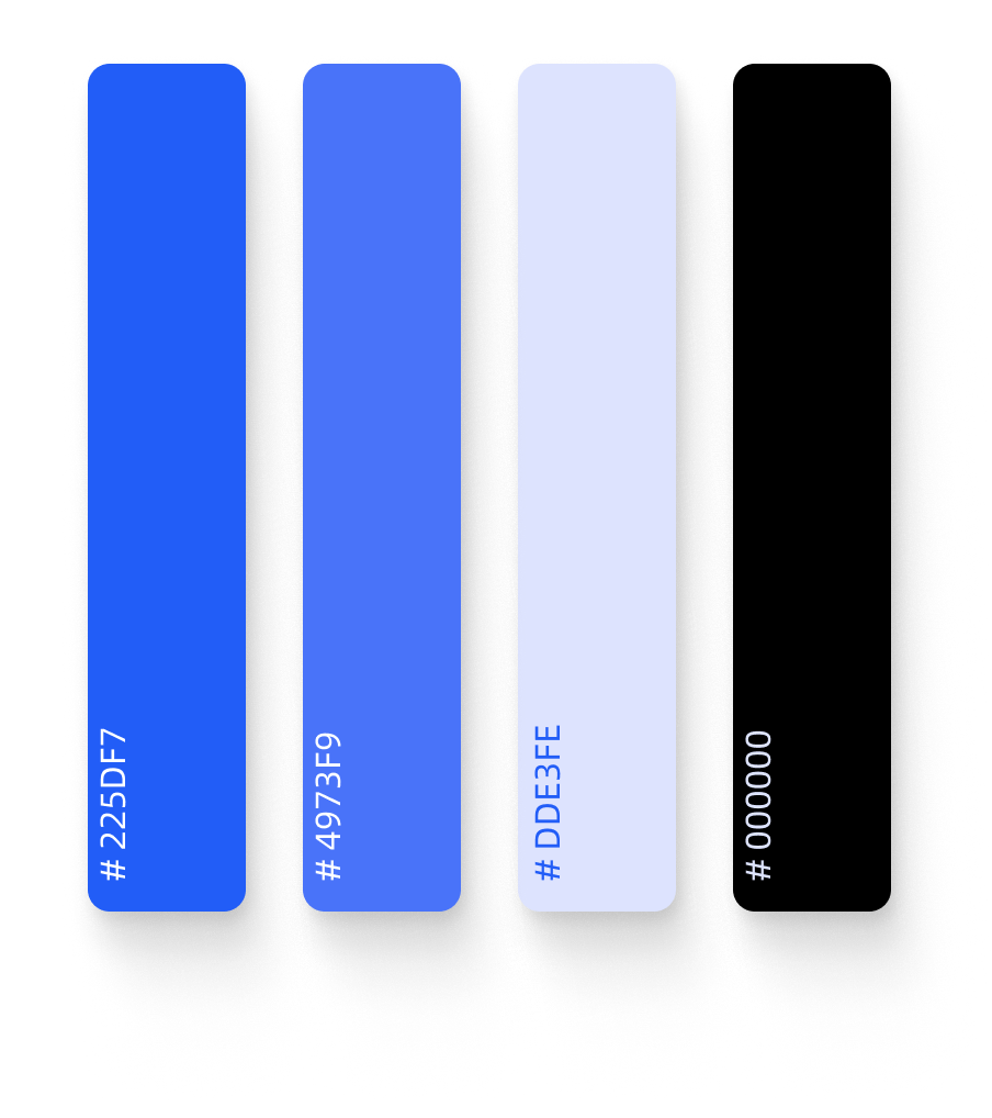
I want the intelligent management app to aligns with the innovative nature of the Transparent Knee Guards, so I decided to pick up a few colors from the products, made some adjustments and applied them to my design.

Colors
Typography


Design Iterations
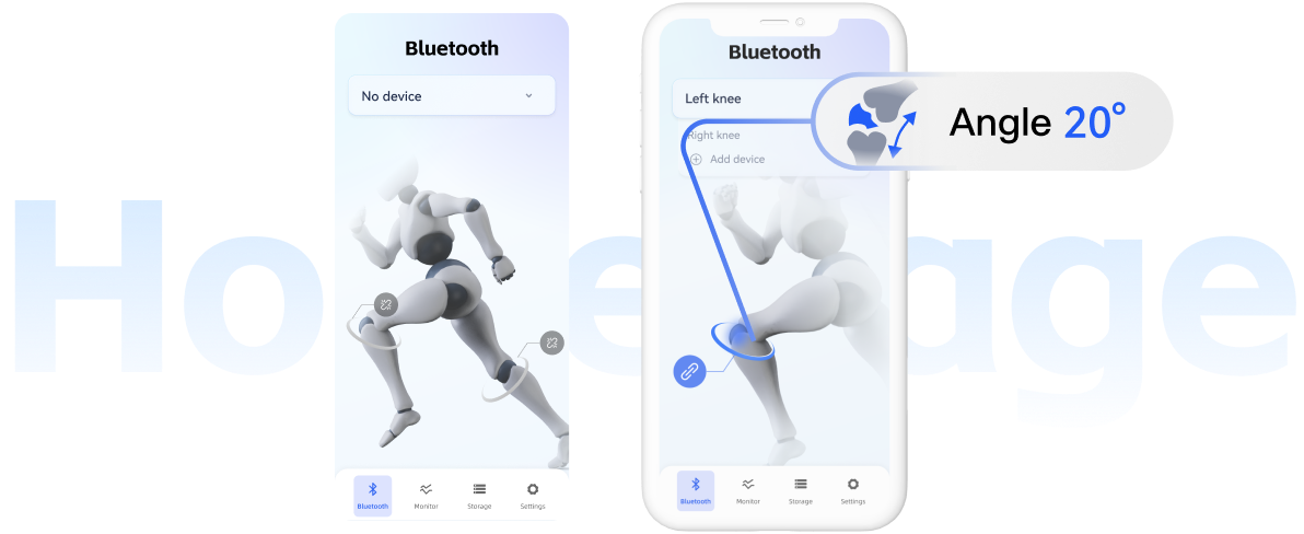
After completing the high-fidelity wireframes for the Transparent Knee app, I recruited some users to test the management app. They provided valuable feedback and suggested keeping the app elements consistent with the sleek and transparent design of the knee guard. For example, the real-time data visualization and the color-coded health indicators are important for users to quickly understand their knee health status.
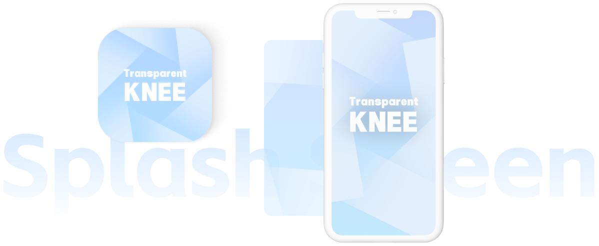
Icon & Loading page
Home
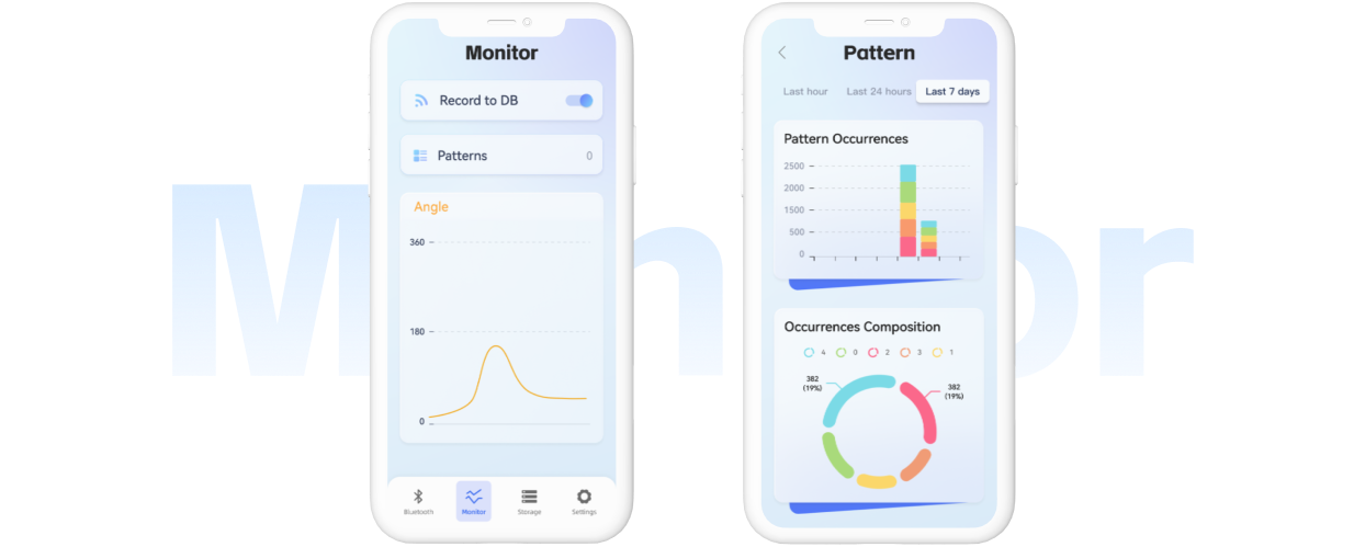
Data analysis
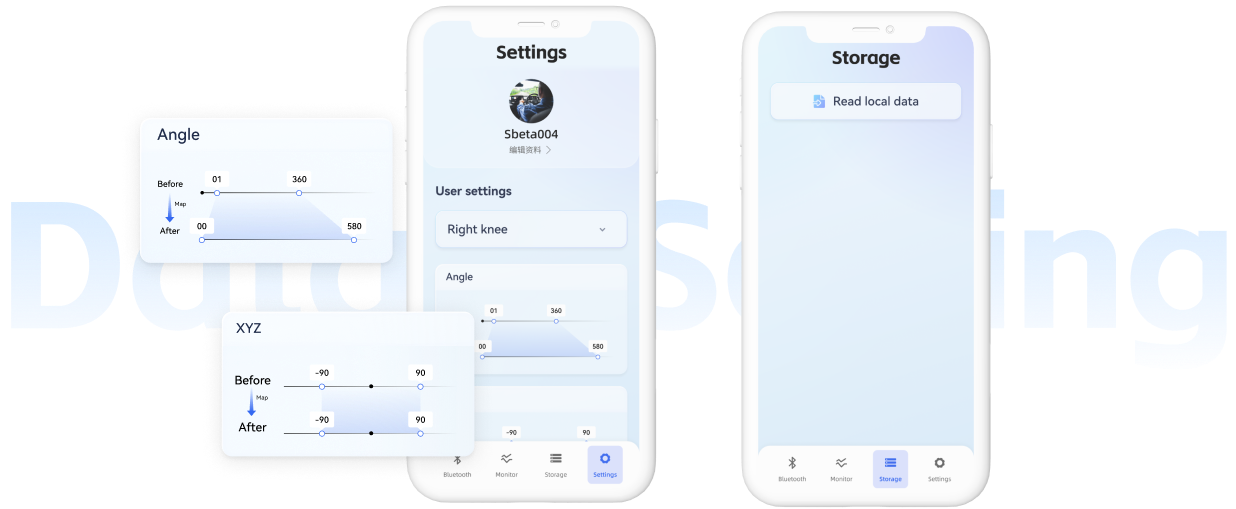
Setting
Poster
